Fintech Design Systems

Year
2022 - 2023
Company
Kapitus
Role
Lead UX Designer
Building a composable, tokenized, and accessible design system for fintech workflows that supports complex data heavy experiences, improves consistency across products, and helps design and engineering teams move faster.
© Fintech Design System

Context
Design System
as the Foundation
A leading business financing provider established in 2006 with a mission to empower growing businesses, recognized the need for a full-scale digital transformation. Rather than a surface-level facelift, we committed to a full-scale transformation, including a fresh brand identity and a unified design system.
I led the creation of a scalable, accessible system that now powers 95% of their digital product suite.
Before the redesign

Foundation
Laying the
Building Blocks
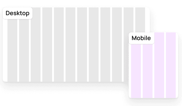
From typography and color tokens to spacing grids and elevation rules, I established foundational standards that drive visual cohesion, accessibility, and scalability.



Atomic design
From Atoms
to Organisms
Core Components: Built Once, Used Everywhere
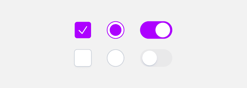
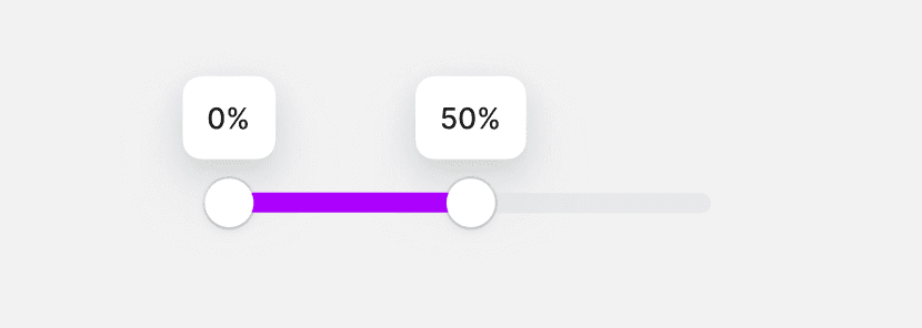
A library of essential UI components such as buttons, inputs, tags, icons, and alerts, designed with consistent sizing, spacing, and states so teams can build screens quickly without re-inventing patterns.





Complex Components: Structured, Composable Patterns
I combined multiple simple components into structured patterns used in real workflows, such as forms, tables, filters, and multi-step flows, ensuring predictable behavior and a consistent experience across the product.

File uploader
Handles different file states with clear progress and feedback patterns.

Text editor
Create and edit rich text with formatting tools like bold, italic, and links.
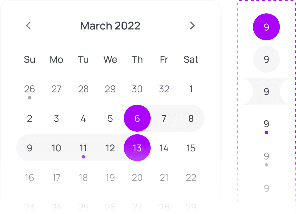
Date range picker
Select start and end dates quickly with clear validation and presets.

Composable Modal
A flexible modal pattern with configurable sections and action.

Dropdowns
Support complex option layouts with badges, icons, chevrons, and shortcuts.
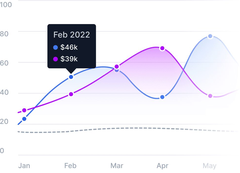
Highcharts
Visualize data with accessible labels, legends, and interactions.
Design adoption
Developer Adoption
Designing for Seamless
Dev-Friendly Naming and Structure
Use a consistent hierarchy and token layers (ref → sys → comp). Name tokens by intent so engineers can find, map, and theme values without guessing.

Customizable and Composable
Enable overrides and flexible composition so designers and engineers can adapt components without breaking the core design logic.

Documentation
Well-Documented
and Discoverable
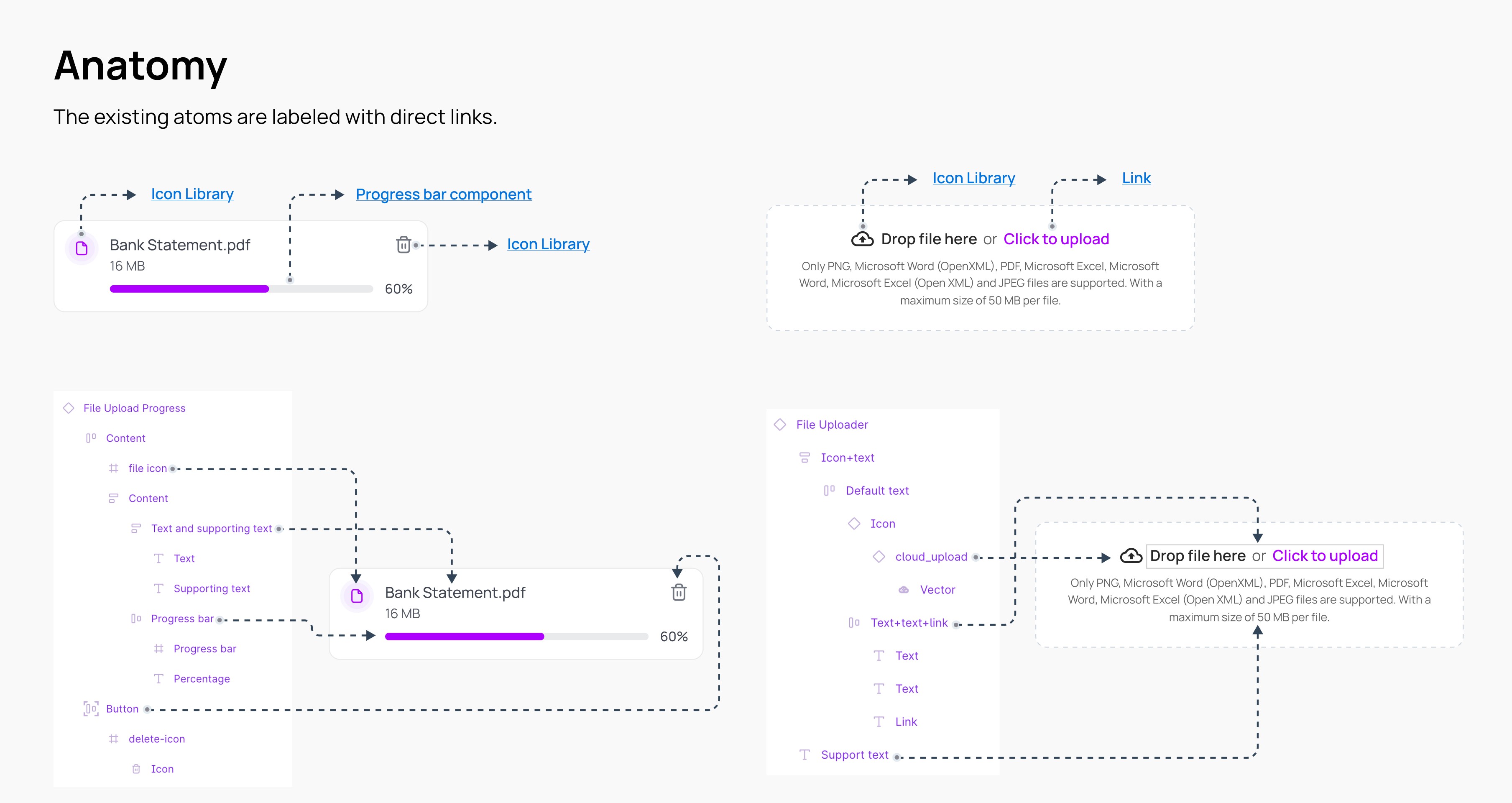
Each component includes clear documentation covering overview, anatomy, specs, usage guidelines, properties, and accessibility requirements, including keyboard navigation and screen reader support.




Design considerations
Designing
With Intent
When building components, I constantly asked: What’s the [rationale] behind this structure? What’s the underlying [engineering logic]? And how will it hold up under [edge cases] and real-world financial workflows?

Removing Guesswork
Through Pattern-Based Rules
To eliminate confusion, I created decision frameworks that guide the selection process. These frameworks map the level of disruption, urgency, and required user action to the appropriate UI pattern, ensuring that every message is delivered in the most appropriate way.

Establishing Action-Driven
Dialog Standards
By providing [concise, purposeful language] and [intuitive call-to-actions], I reduce friction and support faster, more informed decision making that helps users confidently navigate critical financial workflows.

Impact
From Growing System
to Trusted Infrastructure
By the end of the initiative, the system had been implemented across the majority of the product ecosystem, improving both consistency and velocity. Designers delivered 50% faster, engineers relied on standardized components, and users experienced clearer, more predictable workflows.


